Sunday, June 12, 2011

Bayesian Updating about a Politician During a Sex Scandal

Every once in a while, Corrections hears the erroneous argument that we shouldn't care about politicians having sex scandals.  Another version of the argument goes that we should only care about Republicans having sex scandals, for various reasons.  Corrections argues that even when one does not care at all about a politican's personal life, they should care and often condemn a politician in light of a sex scandal.

Why?  We posit that all politicians are unknowns.  We can imagine they have two traits: degree to which they engage in extramarital affairs and the degree to which they are willing to steal from the taxpayer.  Further, we argue these two traits are correlated.  So, we might have a multivariate normal with a covariance matrix with non-zero entries, as depicted in 3D in Figure 1 below (click to enlarge).
So, most likely (on average) the unconditional politician is at (0,0).  But what happens if we find out he's a philanderer?  Then, looking at this image from the perhaps more clear "birds eye view", we see that our new belief about him is that not only is he a philanderer, but he's also dishonest (click to enlarge).  The first, left hand circle is what we believe about a politician unconditionally, e.g. before the scandal.  Conditional on discovering he is a philanderer pushes us to the right of the graph.  Updating about his dishonesty, we find ourselves at a higher point there, as well!
There are, of course, more complex ways to do this, but the point is made: when distributions are not independently distributed, then information on a trait that you may not care about at all should influence your beliefs about something you do care about.


University of Michigan Sentiment Survey

The University of Michigan's sentiment survey doesn't seem to be incredibly stable.  Instead, it seems incredibly noisy for a number thats used so frequently in the press for month to month comparisons (click to enlarge):

Employment to Population Ratio

Below, Corrections offers the employment to population ratio (click to enlarge).  Note the sharp effects of recessions and our current stagnated ratio.

Standard Deviation of the Unemployment Rates in All 50 States

Corrections was idly looking at the unemployment rate in all 50 states over time (click to enlarge):
Other than the "Hurricane Katrina" effect for Mississippi and Louisiana and the Great Recession, the most interesting thing to come out of this graph is the increase in dispersion between the states.  Below, find each month's standard error between states (click to enlarge).  Pretty remarkable. 

Job Search

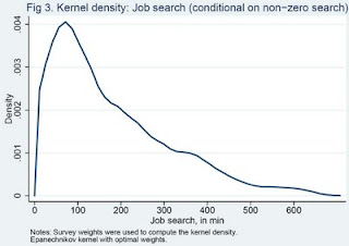
The jobless don't seem to look for jobs very hard.  From Alan Krueger and Andreas Mueller's 2008 working paper, "Job Search and Unemployment Insurance: New Evidence from Time Use Data", it appears that jobless looking for jobs spend about 41 minutes a day looking.  Below, find the distribution of working time (given that they are looking) (click to enlarge).
Rather remarkable.

U.S. Debt Structure

From the database associated with Hamilton and Wu (Forthcoming) ""The Effectiveness of Alternative Monetary Policy Tools in a Zero Lower Bound Environment," (data) (paper).  The maturity structure of U.S. Debt.  "Strands" that disappear in the middle indicate debt structure altered by open market operations.  Strands that cease "starting" indicates that bond maturity is no longer issued (for example, the 5 year bond was retired for some time in the 90's).  The first figure is thirty years of maturities (click to enlarge).
This second year looks only at the distribution of U.S. bonds with maturities of five years or sooner (click to enlarge).

No Bubble #2

An old paper from Greg Mankiw and David Weil, "The Baby Boom, The Baby Bust, and the Housing Market" (1989) offers one possible reason for the transitions we've seen in housing prices: an anticipated baby boom.  The paper offers nice depictions in dynamics that Corrections wishes were present in more papers.  If the boom is transitory, we have supply and demand temporarily moving and falling back down along the same supply curve (click to enlarge)
Or, offers a graph that might be informative about our current housing issues: what would happen to housing prices in a forward-looking and a naïve world under a baby boom (click to enlarge):
Look familiar? (In shape, not in magnitude!)  Almost like a partially-anticipated, rational boom that dissipated when the state of the world turned out to be different.

No Bubble

Was there a housing bubble? For people who think there was, aren't we still in it? When will it pop? Housing has fallen less than half of its "bubble" high (click to enlarge).

Weekly Jobless Claims - Advance Estimates and Final Estimates

Whenever one reads the weekly jobless claim update, one of the highest frequency datasets out there, there are always two new pieces of information in the top line: the advance numbers for that week, and the revised estimate for the previous week.  The revised estimate is always higher than the advance numbers, because there are more delayed unemployment claims.  This would be an innocuous difference, but newspapers and even the report itself always compare the current week's (underestimated) numbers to the last week's (not-underestimated) numbers.  They're always overstating how good this week looks compared to last, and not always by the same amount, as we depict graphically below (click to enlarge).  The figure displays the difference between initial and final estimates for the last few months.

June 2011 JOLTS Release: April 2011's Beveridge Curve

Using the recent unemployment rate from the CPS and yesterday's JOLTS release, Corrections offers an updated Beveridge curve (click to enlarge).  Note the adjusted axes, so that recent trends can be seen more easily.

Israeli Hyperinflation

Israel's 1983 hyperinflation, from Sargent and Zeira (2011): Israel 1983: A bout of unpleasant monetarist arithmetic (click to enlarge).

Drinking Age

Christopher Carpenter and Carlos Dobkin produce a great figure in their article "The Minimum Legal Drinking Age and Public Health" in this Spring's Journal of Economic Perspectives.  The figure reconstructs causes of death by age (in months).  It then runs a best fit line before and after individuals are twenty-one (click to enlarge).
Whether or not you support lowering the legal minimum drinking age, as Corrections does, this graph powerfully the idea behind what being able to drink entails.

U.S. Private Employment: The Long Road Back

First derivative positive, second derivative looks negative (click to enlarge). What is the third?

State+Federal+FICA Marginal Tax Rates by Income by State

Below, Corrections offers and abstract view of marginal tax rates by state by income (click to enlarge). The quite dramatic dropoff after $102,000 comes from the absence of payroll tax.
Raw data extracted using TaxSim version 9.

Congressional Budget Office Predictions and the Truth

Below, Corrections has taken nominal GDP growth predictions from 2000-2011 from the CBO and plotted them against the truth (click to enlarge). The CBO doesn't seem to systematically overpredict or underpredict one-year ahead: of ten one-year-ahead predictions, six are over, four are under. (And it's hard to fault more than one year ahead given the time period we're looking at).
Corrections also offers the same graph but with future years included (click to enlarge).

U.S. Private Employment: January is the Cruelest Month

January is the cruelest month (click to enlarge).

Europe vs. America: Output and Hours

America in 1970-1974 and 1990-1993 are normalized to 100.  These graphs give a comparison between European countries vs. the U.S. in the 70's and in the 90's, with the data from "Why Do Americans Work So Much More Than Europeans?" Prescott (2004).  
European vs. American Hours/Capita (click to enlarge)
  • In the 70's, Germany, France, the UK, and Japan all worked more hours than the U.S.
  • By the 90's, only Japan worked more (and the deficit had closed). 
  • By the 90's, France worked 68% of the hours Americans worked per capita (capita is defined as all persons aged 15-64.
European vs. American Output/Hours (click to enlarge)
  • In the 1970's, the U.S. produced much more per hour than Europe.
  • By the 1990's, this was a mixed bag, but everyone closed the deficit save Canada.
 European vs. American Output/Capita (click to enlarge)
  • The U.S. just makes more per capita.
Why does the U.S. work more and make more even though its output/hours advantage has decreased so significantly?  Prescott's answer: taxes.

Does the U.S. Still Make Stuff?

U.S. Manufacturing Employment over time (click to enlarge):
Corrections disagrees most intensely with people who value manufacturing jobs over jobs requiring creativity.

U.S. GDP from 1870-2010 and Trend

Below, Corrections offers its own version of the now relatively-famous graph in Robert Lucas's presentation using Angus Maddison's data (under "Historical Statistics").  
The mean-reverting nature of log GDP under a very slow-moving trend supports the idea of the absence of a "unit root" in U.S. GDP.

New Orleans and the impact of Hurricane Katrina on Unemployment

Below, Corrections displays the seasonally adjusted unemployment rate of the New Orleans metropolitan statistical area from 2000-April 2011, along with the national unemployment rate (click to enlarge).  Hurricane Katrina's effects on the unemployment rate dissipated within six months.